Interior Ideas showing a Seahorse Built 44 DUCK
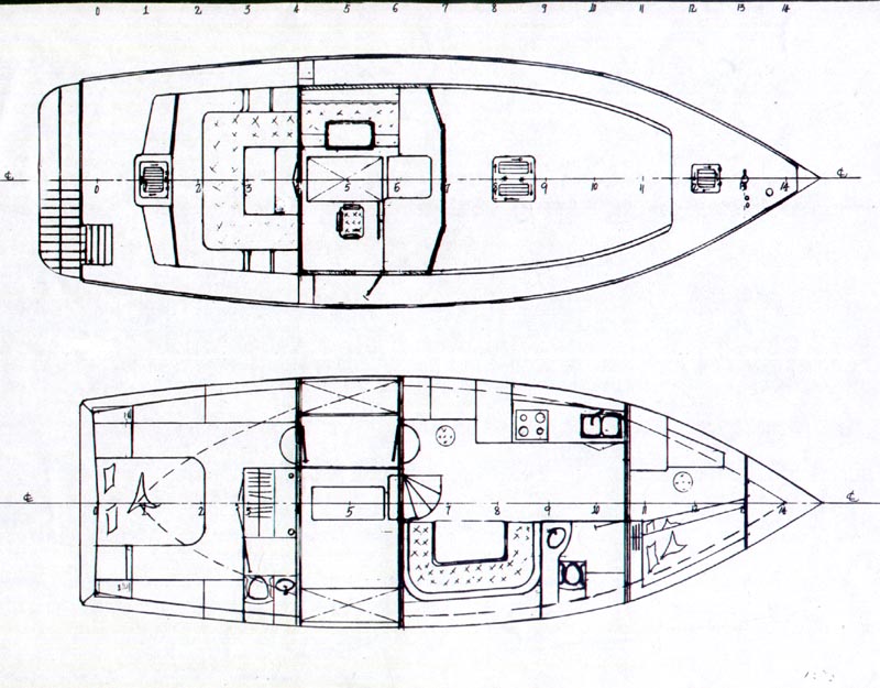
The 44 DUCK shown here has two interior versions drawn so far. First, the “traditional,” which is the original of course. There’s a full hull width engine room, and access to the fwd and aft cabins is through the pilot house. Then there’s the new one that Seahorse came up with and THAT really changes the boat…. Bill Kimley’s interior design which we’ve incorporated into the 44 “Evolution.” This drawing shows the small cockpit aft the wheelhouse. I go back and forth on that;I simply can’t decide if I’d have it or not. I think a bench seat behind the house would do the same thing, but David Katz, the owner who wanted it, is a very experienced single hander and his opinion is worth considering. Rather than the full hull width engine room and aft cabin access from the wheelhouse shown in the plans, Bill installed a bulkhead with large removable hatches beside the engine on the port side. The wheel house has a raised sole with a couch and table (David went for an “easy boy”recliner chair instead!) over the resulting passageway below. This gives easy access to the stern cabin directly from the forward area rather than access to the stern cabin from the pilot house. There’s a doorway in the back wall that takes you out to the stern deck where there’s now an optional small self-bailing cockpit. But keep in mind that if you have a new boat built, you can plan out absolutely ANY interior design you want; that’s part of the reason for building your own boat! A “blank sheet” showing the top and side view of the boat with NO interior is included with every study or building plan, and I’m happy to work with you to develop your particular interior needs.
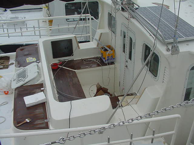
The top drawing shows the pilot house interior and deck. Note the stairway down the transom to the swim platform and the small cockpit that David specified (shown below). The bottom drawing is the interior. Note the passageway to port beside the engine allowing easy access to the aft cabin.
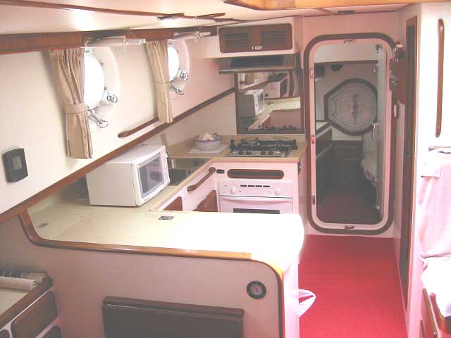
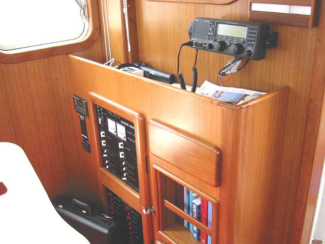
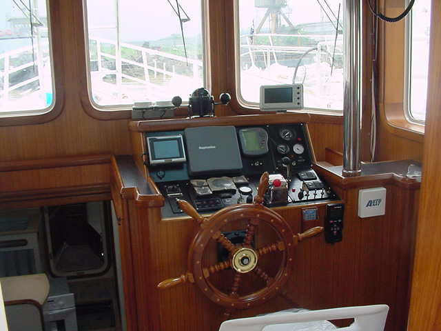
Shooting photos inside a boat is difficult; you can’t get far enough away. Many ads show photos shot with”fisheye” lenses which distort the space, making things look larger than they are. Here’s some views shot with a normal lens…..
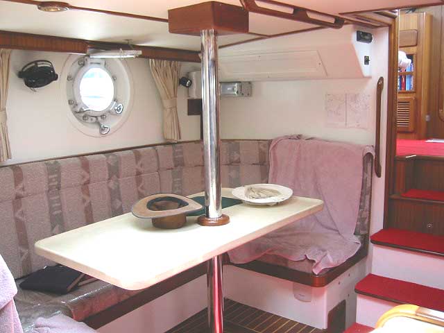
Large “U” shaped dinette.Note the “handhold” on the overhead near the table and the huge opening ports.
Don & “Takka’s” Duck is laid out just a little different. Excuse the commissioning clutter!
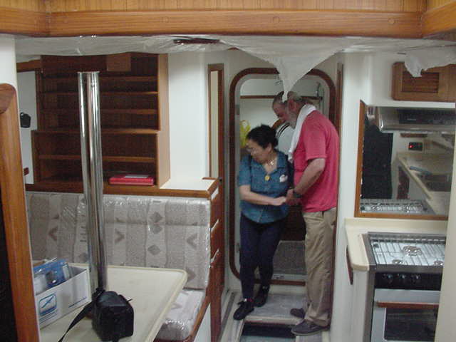
The Galley is across from the dinette
Two views of the Helm area
NEXT to continue on with the photos.
